


MUSIC + CULTURE

NEW + NOTEWORTHY


The Latest


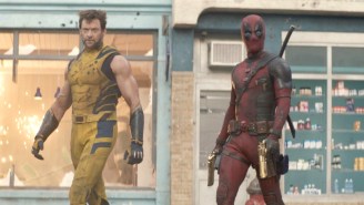
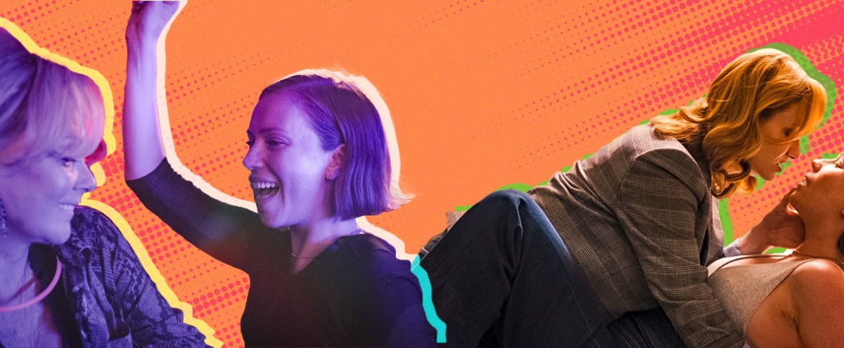
The 10 Best New Shows/Movies To Stream


Featured


UPROXX SHOWS


WATCH NOW
WATCH NOW

UPROXX Sessions: Josh Levi - "She Keeps Comin"
Watch Next
React Like You Know: Paramore's "Misery Business"

Fresh Pair: Ice Cube
We Live For Music


The Best Of Streaming


Styles Of The Times


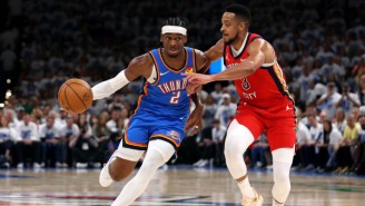
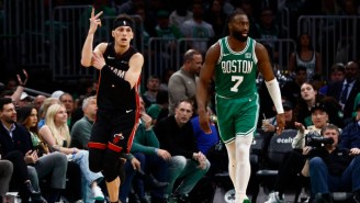
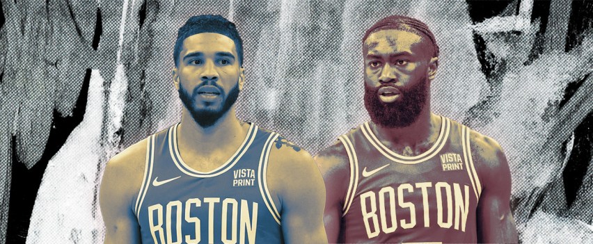
As The NBA Turns


The Latest